AdMedSol - Surgical Business Unit
Evolving and realigning brand assets for a global medical company.
Branding | Motion Graphics
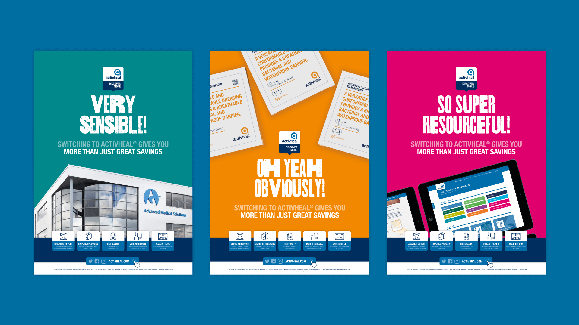
Surgical BU is a business unit within The AMS Group, providing high performance, surgical technologies. Due to multiple acquisitions, the company felt disjointed. An amalgamation of styles, colours and fonts meant that the overall brands had little cohesion. In order to align each of the companies to a cohesive brand styling, all brand elements were considered. Issues included: varying tones of the same colour, multiple logo versions and a lack of fluidity across font styling. On request an over arching logo was created to encompass all brands under a single image. This helped promote hierarchy and consistency both internally and externally. Logos for each of the individual acquired companies were also redesigned so that there was a strong feeling of unity across all sub brands. Designed whilst at Lumisi.
